How I Choose Pastel Paper
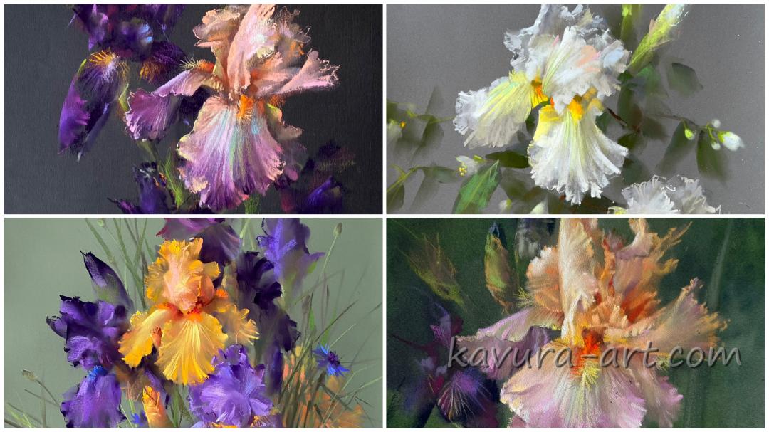
One of the questions I am asked most often is: "What pastel paper do you use?"
For me, pastel painting is always a dialogue between the pastel and the surface. The paper is not simply a support—it influences the way I paint, the atmosphere of the artwork, and even the final appearance of the colors.
Because I often leave parts of the paper untouched, its color becomes an essential part of the composition rather than just a background.
The surface must also support my painting technique. I work with thin, transparent layers of pastel, gradually building both delicate transitions and rich color. I need a paper that holds many layers while remaining smooth enough that even the lightest line is clean and uninterrupted.
I avoid coarse textures and pronounced paper grain because they interfere with the softness and transparency that I try to achieve.
The color of the paper always depends on the subject. Green papers often create a natural harmony for floral arrangements because they echo leaves and stems. Sometimes the bouquet itself suggests warm pinks, muted greens, or earthy tones. At other times I deliberately choose contrast. Large yellow flowers on blue paper create a subtle visual vibration that would be impossible on white paper. Grey, anthracite and black papers provide a calm, neutral foundation.
All of the papers listed below also allow me to work with a light watercolor underpainting. I use only a moderate amount of water. The watercolor is not intended to completely change the color of the paper—it simply enriches and strengthens its natural tone.
Papers I use
Clairefontaine Pastelmat
• Anthracite
• Blue
• Wine
• Brown
• Light Grey
Art Spectrum Colourfix
Smooth: Leaf Green, Dark Blue
Original: Leaf Green, Dark Blue
Canson Mi-Teintes Touch
• Grey
• Dark Grey
Canson Velvet
• Pistachio
• Grey
Liked? Leave your comment: